

Your Website Is Not a Brochure Anymore. It Is Part of the Product Experience.
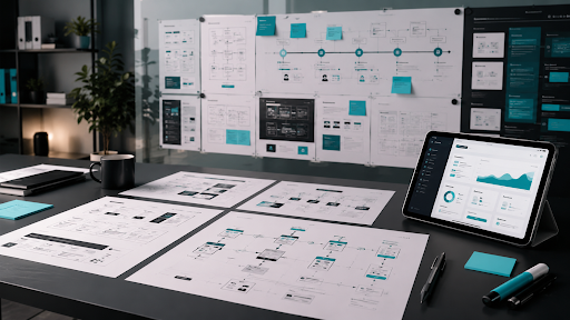
A brochure website belongs to another era. It exists to say who you are, what you do, and how to contact you. That may have been enough when buyers were more patient, competition was lighter, and sales conversations started earlier. It is not enough now. In 2026, web development for SaaS has to do more than present information. It has to educate, qualify, persuade, and move users toward action without forcing them to wait for a sales call.
That is the real shift many SaaS companies still have not fully accepted. Your website is not just a brand asset. It is part of the buying experience. It is often the first product impression, the first trust signal, the first competitive comparison, and the first real test of whether your company understands modern user expectations. If the site still behaves like a polished company leaflet, it may be costing you more than you realize. Not because it looks bad, but because it fails at the real job: converting curiosity into momentum.
A Brochure Website Tells. A Growth Website Moves.
The biggest problem with brochure-style websites is not that they are simple. The problem is that they are passive. They talk about the company instead of guiding the buyer. They explain services instead of helping visitors understand outcomes. They show features without building urgency. They place calls to action at the end as if the buyer has nothing else competing for their attention. They feel complete to the internal team because the information is technically there, but they do not behave like a system built to generate demand.
A growth-focused SaaS website works differently. It moves the visitor through a sequence. It clarifies the problem. It frames the opportunity. It shows why the product matters. It reduces hesitation. It offers proof. It creates the next step. It does not wait for the buyer to figure everything out alone. That is the real difference between having a website and having a website strategy.
SaaS Buyers Now Self-Educate Before They Ever Talk to Sales
This is where many outdated web strategies collapse. SaaS buyers are not waiting for your sales rep to explain the category anymore. They are researching independently. They are comparing multiple solutions. They are checking pricing expectations, product fit, integration compatibility, use cases, onboarding friction, proof points, and trust signals long before they fill out a demo form. That means your website has to do more of the heavy lifting earlier in the process.
If a visitor lands on your site and still cannot quickly understand who the product is for, what pain it solves, how it fits into a workflow, or why it is different, the site is not helping your pipeline. It is slowing it down. The company may still get leads, but the website is doing less than it should for the amount of traffic, content, outreach, and brand effort going into it. Modern web development for SaaS should respect how buyers actually buy now, not how companies wish they still bought.
The 2026 Standard Is Clarity, Speed, Structure, and Intent
A modern SaaS website should not feel overloaded, but it should feel purposeful. That purpose shows up in four areas. First, clarity. Visitors should understand quickly what the product does, who it is for, and what business problem it solves. Confusion is expensive in SaaS because buyers have alternatives. Second, speed. Slow-loading pages, unstable layouts, and bloated user experiences kill momentum before messaging even has a chance to work.
Third, structure. The site should guide the visitor naturally from headline to proof to product understanding to next action. Pages should not just exist. They should perform a job. Fourth, intent. Every section, CTA, page path, and supporting asset should serve a conversion objective. A SaaS website that looks modern but lacks conversion intent is still underperforming. This is why web development for SaaS cannot be treated like a generic design project. It is a growth infrastructure decision.
If Your Website Still Leads With “About Us,” It Is Already Behind
One of the clearest signs of an outdated SaaS website is when the company leads with internal positioning instead of user relevance. Buyers do not arrive asking to learn your origin story first. They arrive trying to decide whether your product fits their need. That means the site should lead with the buyer’s reality. What problem are they trying to solve? What friction are they experiencing? What result are they hoping to create? What makes your product easier to trust, adopt, or understand?
The best SaaS websites feel customer-centered from the first screen. They do not waste the hero section with vague brand slogans that sound polished but say very little. They get specific. They connect product value to user pain and business outcomes. That specificity is what creates traction. A vague website may still look expensive. It just does not sell well.
Web Development for SaaS Has to Support Discovery, Not Just Presentation
A modern site is not only a conversion environment. It is also a discovery environment. Buyers may find you through SEO, GEO, referrals, social proof, direct outreach, AI tools, comparison research, or branded search. If your website is only structured to “look good,” it misses the larger opportunity. In 2026, discoverability matters across both search engines and AI-driven answer environments. That means your site architecture, page depth, internal linking, product clarity, and authority signals all matter more than before.
ZeroDark has already explored this shift in its article on GEO for founder-led growth. That shift is highly relevant to SaaS companies because a strong website now needs to work not just for human visitors, but also for the systems that surface, summarize, and recommend brands during discovery. This is where brochure thinking falls apart. Brochure sites are built to exist. Strategic SaaS websites are built to be found, understood, and acted on.
Good SaaS Websites Reduce Friction at Every Stage
SaaS buyers are extremely sensitive to friction. If the path to understanding feels difficult, they hesitate. If a page is cluttered, they skim without absorbing. If pricing feels evasive, trust drops. If forms ask too much too early, conversion declines. If the website hides real proof, buyers assume the product is less mature than it may actually be. This is why web development strategy has to think beyond aesthetics.
Friction reduction can mean simplifying navigation. It can mean making product pages easier to scan. It can mean improving how integrations are explained. It can mean better CTA timing. It can mean a cleaner demo path, stronger case studies, clearer feature hierarchy, faster page loads, or better onboarding-related content. Each of these decisions affects conversion because each one changes how much work the buyer has to do mentally before taking the next step.
Proof Is No Longer Optional
A brochure website can get away with polished claims. A serious SaaS growth website cannot. Modern buyers want evidence. They want to see who the product serves, how it helps, what outcomes it creates, and whether other businesses trust it. They want use cases, testimonials, recognizable customers, implementation clarity, and content that demonstrates expertise.
Without proof, your messaging has to work too hard. With proof, the site becomes easier to trust. This is especially important in SaaS because buyers often compare several platforms that sound similar at a surface level. Proof helps separate positioning from reality. It shows the product is not only well-described. It is actually working for real users.
Accessibility and Usability Are Now Strategic, Not Cosmetic
One major mistake companies make is treating usability and accessibility as technical side tasks instead of growth decisions. A site that is difficult to navigate, unclear to scan, or frustrating across devices is not only a UX issue. It is a business issue.
Google’s Search Essentials reinforce the importance of making pages accessible, usable, and valuable for people first. That matters because the same qualities that help search visibility often help user trust and conversion as well. Google Search Essentials. This is where modern web development for SaaS becomes more mature. It stops thinking only about how the site appears and starts thinking more deeply about how the site performs for different kinds of users, traffic sources, and buying journeys.
Your Website Should Support the Full Funnel, Not Just the First Click
A strong SaaS website does not end its job at the homepage. It supports the full funnel. Top-of-funnel visitors need education and category clarity. Mid-funnel visitors need differentiation, proof, use cases, and deeper product understanding. Bottom-of-funnel visitors need confidence, trust, a clear CTA, and low-friction next steps. Existing interest often needs reinforcement through pricing context, implementation signals, FAQ sections, demo flows, and conversion-focused resource paths. If your website is only designed to make a first impression, it is underbuilt. A SaaS website should be able to support awareness, evaluation, and action without collapsing into generic messaging halfway through the journey. That is what makes it strategic rather than decorative.
A 2026 SaaS Website Should Behave Like a Revenue Asset
The companies winning in 2026 are not just redesigning websites. They are building revenue assets. A revenue asset does not simply hold information. It supports demand generation. It improves the efficiency of paid traffic. It strengthens SEO and GEO visibility. It increases trust from outbound traffic. It helps sales conversations move faster. It creates better qualification before the first call. It lifts conversion from content, outreach, and brand traffic that would otherwise leak away. That is what modern web development for SaaS should deliver. If your website still looks like it was built mainly to explain your company rather than accelerate your pipeline, it may be doing far less for growth than you think.
Turn Your Website Into a Growth System
Your website should not be your nicest-looking underperformer. It should be one of the hardest-working assets in your go-to-market system. ZeroDark helps SaaS companies think beyond static web presence and build growth systems that align positioning, user journey, discoverability, messaging, and conversion strategy. If your current site still behaves like a digital brochure, the problem is not just design. It is that the website strategy has not caught up to how modern buyers actually evaluate software. If you want a SaaS website that does more than look credible, and instead works as part of a measurable demand engine, schedule a demo and free audit with ZeroDark.
FAQs
What is web development for SaaS?
Web development for SaaS is the process of building a website that supports software growth goals, including discoverability, product education, conversion, trust-building, and user experience across the buying journey.
Why is a brochure-style website bad for SaaS companies?
A brochure-style website is bad for SaaS companies because it presents information passively instead of guiding buyers toward action. It often lacks conversion structure, clarity, proof, and strategic messaging.
What should a SaaS website include in 2026?
A SaaS website in 2026 should include clear positioning, fast performance, strong page structure, product education, proof elements, strategic CTAs, internal linking, search visibility support, and a conversion-focused user journey.
How can ZeroDark help improve a SaaS website?
ZeroDark helps SaaS companies strengthen website strategy through clearer positioning, funnel alignment, conversion thinking, discoverability support, and growth-focused website performance.